BETHANY
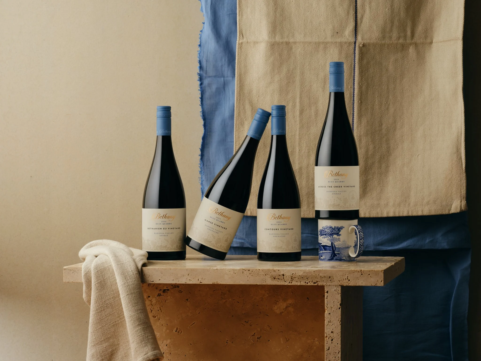
Bethany has been part of Barossa wine history since 1852. The Bluestone Quarry on which Bethany is situated was instrumental in providing the raw material from which the town was built. This range of wines derives its name from this quarry.
SCOPE
Packaging
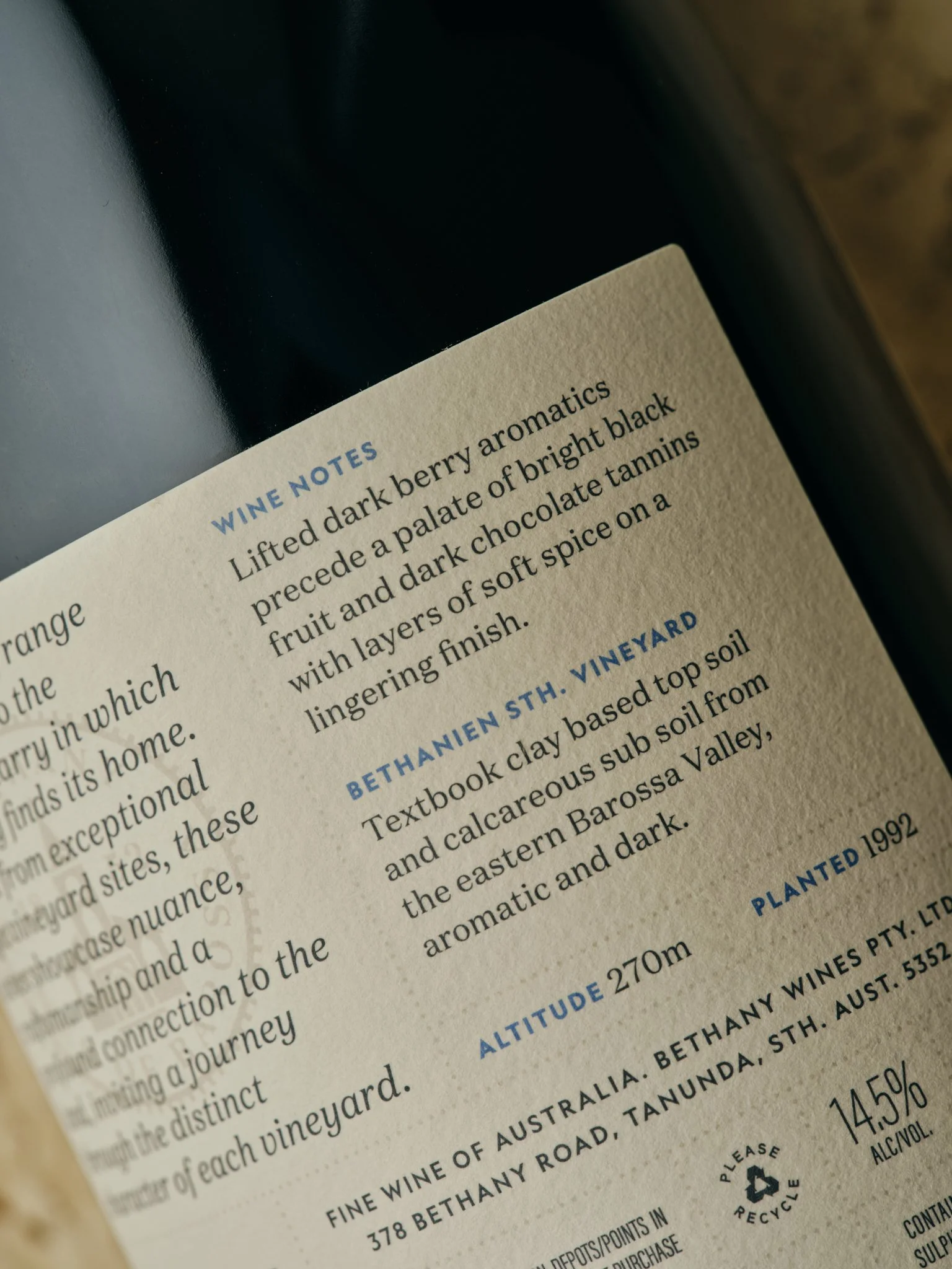
Copywriting
ABOUT
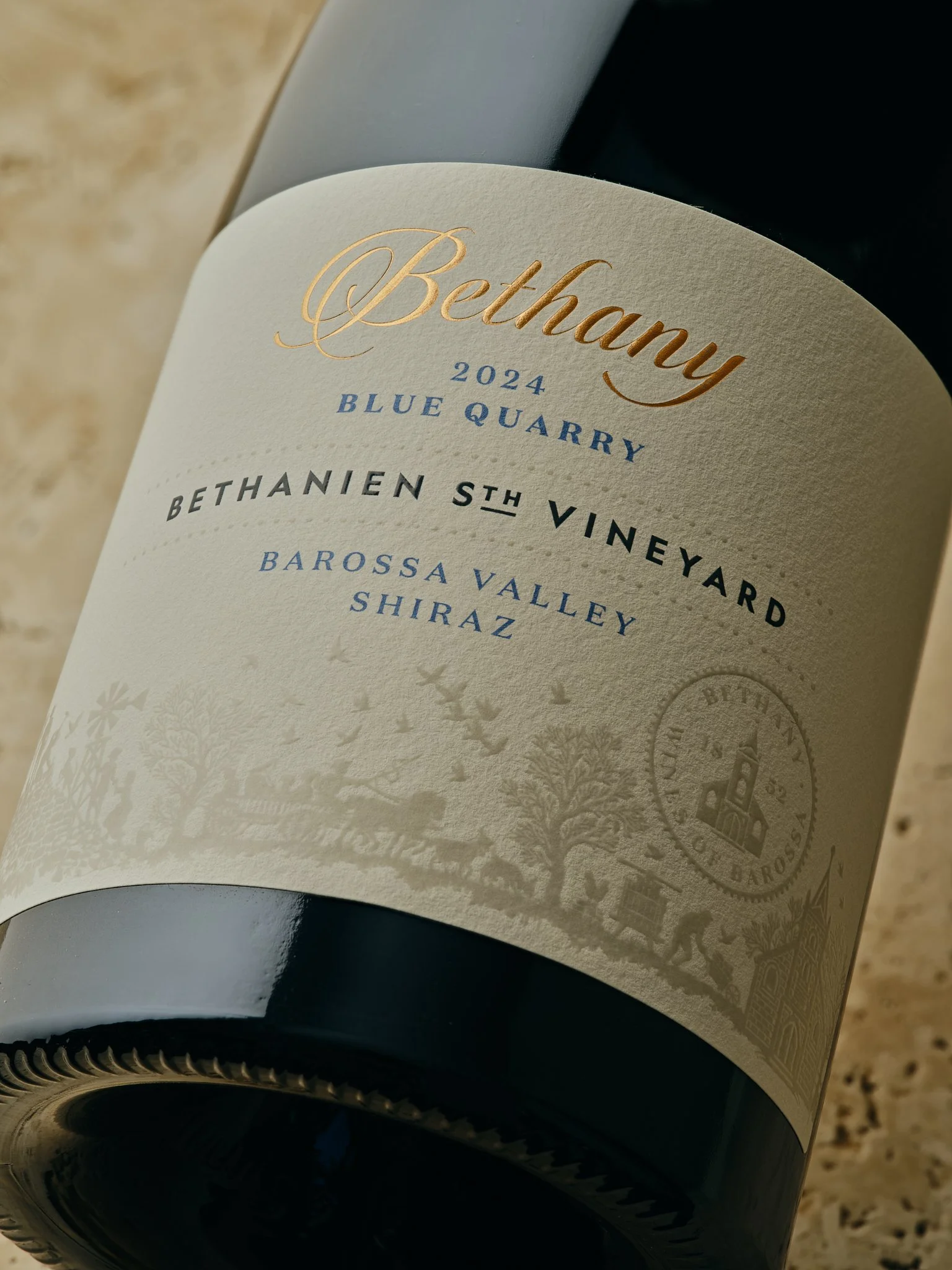
Our task was to redesign the Blue Quarry range of wines to better represent its price point within the Bethany brand, and to better (and compellingly) tell the Bethany brand story.
Inspired by the successful First Village range of wines, we executed the illustration in a premium finish, giving the wines clear hierarchy within the range, while linking the two ranges' visual story for stronger brand consistency and recall.
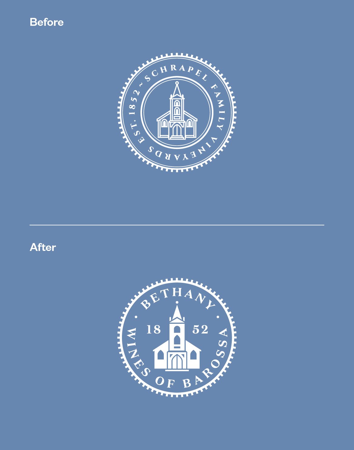
An accompanying evolution of the Bethany secondary branding aids in legibility and adds contrast within the design, while offering a cleaner print finish along with flexibility of use for future applications, be it signage, uniforms or anything else the future holds.